Recently, I’ve been grappling with the issue of what a corporate homepage should do. Obviously, a lot of what I do is central government-oriented but in this case I’ve been casting the net quite wide, as the interface design problems of corporate organisations in whatever sector are actually pretty similar.
A corporate homepage generally isn’t trying to sell, but it might be trying to signpost customers quickly to an e-commerce microsite or customer portal. It’s not aimed at a nice, neat target audience, because it’s got to work for journalists, students, staff, investors and a whole bunch of other people. It’s promoting a wide portfolio of products or services, trying to illustrate it with imagery which is engaging but also generic. And corporate homepages by definition have a large number of people within the organisation clamouring for space and priority.
Some focus on identifying and signposting different audiences, some try and help people accomplish their goal and some just aim to tell compelling human-scale stories about megalithic organisations.
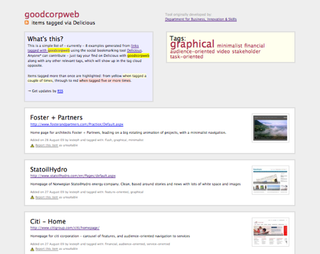
So I’m starting a collection of good corporate homepages, using the Bookmarklist open source tool that powers Digitalgovuk. In a nutshell:
- Find an intelligent, elegant homepage of a corporate organisation (i.e. not a startup or personal site, and not primarily a sales or campaign site)
- Bookmark it in Delicious using the magic tag ‘goodcorpweb’ along with other descriptive tags e.g. the sector, the style and anything else that’s relevant
- It will magically appear at: http://www.helpfultechnology.com/goodcorpweb for anyone to browse and discover
Between us, we can give corporate web teams the world over a useful collection of great inspirations for a tricky interface design challenge. Thanks!


Comments
I’ve been tagging a few sites goodcorpweb but they aren’t showing up. Is it working?
No sir, you’ve been tagging it “goodcorpweb,” which is a different kettle of fish.
Go back and do it again 🙂