When the National Pandemic Flu Service launched last week, it was always going to be big. As it transpired, the demand was massive, beyond even what the developers had predicted with over 2,000 requests a second for the homepage.
When I checked the site later that day (for professional reasons), I was surprised. To be clear: I don’t really know how or why the site looks as it does: I’ve not been involved in that to date, and there’s always internal politics, a technical backstory and a team doing their best behind every government website. But as a lay outsider I started thinking: in a fantasy scenario, how would I have done it?
For me, the brief would be:
- Provide clear, authoritative, citizen-facing information about dealing with swine flu
- Aimed at citizens, but inevitably also signpost the employers who stumble across it looking for information
- Reduce load on telephone lines and GPs through online self-service, preferably of low-bandwidth static content
- Set up an ongoing channel of communication with the public to keep them updated as advice changes, vaccines become available and so on
- Be navigable by people with flu-like symptoms
So here are my before and after mockups (you’ll see I’m no designer, but hopefully you’ll get the idea):
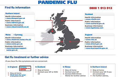
Original:

See larger version at: http://www.direct.gov.uk/swineflu
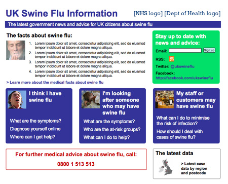
My version:

What’s different?
- Key facts: how worried should we be? A few crisp bullet points about the disease itself
- Stay in touch: a strong call-to-action to connect with the service on an ongoing basis through email primarily, but also social media channels (n.b. there’s some good work being done on wider swine flu digital engagement in the UK, aiming to catch up with some of the brilliant stuff over in the US, and I’m not really talking about this here)
- Stronger branding: the common term ‘swine flu’ rather than the more scary ‘pandemic’ and clear endorsement of the site by the NHS and Department of Health
- Navigate by your relationship to swine flu, not UK nation: the critical change in this design is the replacement of the non-clickable map with 12 links around it, with a set of 3 prominent boxes routing the visitor to help/tools relevant to their current relationship with swine flu. I appreciate that devolution in the UK complicates national advice on health issues, but from the outside, it’s hard to see how nation-based advice on a single website could be the optimum primary navigation route for this content
- Prominent access to data, for transparency: there’s a strong argument for transparency by government on this issue to build trust and credibility for the advice being given. Providing direct access to RSS feeds, original briefings and region/postcode-level data about cases seems like a wise thing to do if it’s possible – even if it’s only a minority of the citizen audience who want to drill down into that material themselves.
As I say, this was just a quick exercise in user-centred design – very much in a personal capacity. How would you have done it?
UPDATE: After I wrote this, I stumbled across the US flu.gov and @flugov on Twitter. The design is, ahem, basic (in fact, I didn’t believe it was an official site at first), but we’ve come to similar conclusions about strategy: email signup, use of Twitter, publishing of data and FAQ-type content.
UPDATE 2: I’ve replaced the mockup which used Dept of Health and NHS logos with a version which doesn’t – to be clear, I’m not implying any link between this website and official information on swine flu.

Comments
your site is so much clearer, I too was dismayed when I saw the NHS site. I seemed to go round in a loop when I was looking for information on it. The basic rules don’t seem to have been applied, KISS and GIGO.
The theme on your site is so much more useful for first contact if someone is wanting info. well done.
I agree. What the site does show is the ridiculous divisions we have: advice for England; advice for Scotland; advice for Wales…Are there regional variations in the virus?
That aside, the site is crap as you say. One like yours would have been trivial to produce and would have given people what they wanted to know in a clear and unbiased way.
http://www.fitmyfit.com/list.asp?id=3060
[…] This post was Twitted by CharlieBeckett […]
The real site looks like a spoof – advice = Stay at Home – Stay at Home – I said Stay at Home : DON’T PANIC
It just hammers home the need for user testing. Even done with a small group (guerilla) would have immediately showed up the design flaws.
I (via Jack P) also discovered issues with SEO http://paulcanning.blogspot.com/2009/07/swineflu-nhs-fail.html
Like it Steph. If I had to add anything I’d include a little live myth busting – the Sun said x, y and z today and here’s the NHS response in under three paragraphs.
NHS Choices is great at this (http://www.nhs.uk/news/2009/07July/Pages/Swinefluandimmunosuppression.aspx) although probably too technical for this site
I like your design a lot more than the NHS one. Since GPs and other health workers are getting a bit overloaded, good info and instructions could realy help a lot to lessen the burden.
I hope other countries are taking lessons, and are consumer testing their websites!
Some science based games for children and adults would be great. Here in Sweden, we had a quiz game named Backpacker, that stayed high in sales for several years.
Thanks all – there should be some kind of regular online service where people get to redesign government websites collaboratively 🙂
@Paul: I saw your post earlier in the week about SEO (which has been exercising me at work over the last day or two). To be honest, I thought you and Jack were a bit harsh – the phrase he’s ‘optimised’ for as it were is a bit niche and they do seem to have been out keyword buying for more common search terms for citizen-based questions about swine flu. Now on the business side, it’s a different story…
You may be right, I don’t know what are the vast proportion of search terms around swine flu. The other point though was that keyword buying isn’t enough – you need to be tops in natural search. I suspect (maybe you know?) that they addressed that in-house and in this area, especially when quick solutions are required, it really is better to hire the experts.
On your other point, no it is not good enough to do collaborative design. They HAVE to be tested. It just doesn’t appear to me to be part of .gov web design culture and that’s a serious mistake.
What would be more productive would be to do collaborative user testing and publish the results. Hmmm …
Considering all the well-known web development talent in the Uk–that do brilliant UX, IA, accessibility, and so on like Clear Left, Erskine, Andy Clarke, Mark Boulton, the list goes on, it’s incredible that for a site so important as this one the public gets…one ineptly made, rather useless page.
Your version is great–but in every way it entails a lot more work and responsibility, and it’ll be more expensive, too.
Every cloud has a silver lining.
Maybe this is the silver lining in swineflu. If it shows government departments that websites can be clean and simple and just deliver the info that the punter wants?
I don’t agree with the previous comment, why would your version entail more work and responsibility or cost more than the original. It may be interesting to find out what the original cost?
When I first saw the swine flu site I was shocked at how poor it was. It doesn’t look like an official Government website. My attention is also drawn to the “England – http://www.nhs.uk” link – I didn’t think to check lower down the page at first!
All websites should be clear and provide the users with the information they want quickly and easily – they shouldn’t have to contend with the map as the first thing.
Add to that the fact that the design of the website changes when you click on the assessment link. So much for consistent and clear design!
I agree with the comment above, it wouldn’t have taken much effort to produce a clearer and more useful design. I’d be interested to know how much the website cost to produce.
‘@cyberdoyle and dafydd,
There are a bunch of reasons why the web site built out from Steph’s prototype would be a lot more expensive; it is a much much bigger project than a one page directory of links placed on a decorative background image of the map of the UK, that was probably made by one person in a couple of hours (however you figure that cost, it can’t be very much).
Steph’s prototype calls for the creation of content about the flu that’s probably not on any of the health web sites the directory has linked to, at least in the focused and topical way that Steph has indicated. Therefore, Steph has used the principles of user-experience design / information architecture to ask, what sorts of information would people be looking for depending on how they are being affected by the flu, and then created a layout to help people get to the kind of information they need as directly, as quickly and easily as possible. She has also added a number of applications to help inform the web site’s users at other times and in other ways, and to keep them in touch with changes and updates, especially useful as all the information around the flu is subject to immediate changes. A web site and its applications are, of course, ideally suited to deal with all that.
Steph’s homepage is, then, a prototype for a reasonably large multi-sectioned web site; its creation and maintenance entails a lot of work, time, talent, and expertise both initially from a team of web developers and the content creators and then from the knowledgeable staff who will have to update the information on the site as well as posting very frequently at least on twitter and facebook if they are to have any value as well as responding to emails. The RSS feed is generated automatically but the news itself must be collated by someone and that will have to happen frequently as well if the site is to remain a news source.
As some one who builds web sites, I work as a UX/information architect and front-end developer, I can assure you that Steph’s prototype is certainly great work and that its building out to a real site is a lot of work and expense especially compared to a single page with a handful of links, probably made in a couple of hours, and that requires no maintenance or staff.
Hi Anon. I still think the current pigflu site is worse than having nothing. At least if we followed Stephs homepage the people would have access to what they were looking for. All you are saying is the old site works, but I say if it hasn’t got the information on it then it isn’t working even if it is. which it isn’t… This explanation sounds as hazy as the current swineflu site, binalongday.
Hi cyberdoyle, I think you missed this part of my first post: “it’s incredible that for a site so important as this one the public gets…one ineptly made, rather useless page.”
I’m just going on, in far too much detail, about the contrast between what should have been done and what hasn’t. The point I was making is that Steph’s much needed improvements amount to more than just a better design and entail more effort, responsibility, and money on the part of somebody…the web site/directory page that got made, as you say, has perhaps left people off worse than they were.
[…] government, I found myself in rather hot water at work after a wayward tweet during a reshuffle and a post rethinking the UX of the then hot-topic Swine Flu website which greatly upset a Director General. I was ‘uncollegiate’ and […]