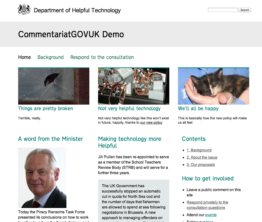
It’s almost Christmas, we skipped the 24tips this year, so I thought I’d release a cheeky little mince pie of a WordPress theme in case others find it useful.

Today’s seen the launch of the latest little site on our Read+Comment platform, designed for fast-turnaround, flexible publishing of documents for comment. DCLG wanted a site to make commentable the Report of the Planning Guidance Review, led by Lord Taylor of Goss Moor. DCLG is one of the pioneer departments which has moved its corporate site to GOV.UK, so this was an opportunity to revisit Commentariat, the customisable WordPress theme I developed for Read+Comment, and sprinkle a bit of the GOV.UK cosmic dust over it.
CommentariatGOVUK, the new version of the theme, is designed to be reminiscent of the Inside Government part of GOV.UK, in terms of basic layout and some elements of typography. Clearly, there’s a lot more to the GOV.UK platform than visual design, but we’re not in a position on Read+Comment to impose style guides or integrate with other Departments’ content. But we can offer a bit more flexibility in terms of functionality through the openness of the WordPress platform, and the skills that are out there amongst WordPress developers.
See a demo of the theme in action (content from ministryoflorem.com)
I quite like the simplicity and flexibility of what we’ve come up with, and decided (with CLG’s support) to release it today:
- A range of templates to support home pages, landing pages and content pages with an easily accessible table of contents
- Flexible menus to link to forms, other sites, or pages
- Ample use of WordPress widget areas to drop in RSS feeds from elsewhere, little promos, listings and videos
- The same kind of user-friendly theme options panel that we’ve always had, enabling site managers to customise colour schemes, decide where comments should sit and add their own tracking code or custom CSS
- Added responsiveness, so things work nicely on smaller screens, thanks to a new foundation based on the 1140 Fluid Grid and Starkers reset theme (our standard WordPress starting point these days)
The theme works nicely coupled with a few solid WordPress plugins we often find ourselves implementing for clients, particularly Spots from the chaps at InterconnectIT and Gravity Forms (for flexible response forms).
On the DCLG site, we’ve used Transport New from K-Type, a budget DIY version of the elegant typeface GDS commissioned, but which hasn’t been released or made commercially available, yet. Since this is a paid-for typeface, we’re not able to distribute it here, but included a couple of links so you can set this up yourself if you want to. Otherwise, things just fall back to Arial, which looks just swell.
It’s labelled as a 0.1 theme, and it has its rough edges. But in the spirit of its big daddy, I thought I’d ship early and iterate. If it’s useful to you, or you find yourself making your own enhancements, do let me know. And of course, of you want a bit of help with tweaking and hosting, we’re more than happy to help with that too.
Download CommentariatGOVUK (zip, 571kb)
Merry Christmas!

