About 60% of my work these days is for the public sector, which is great, as it reflects my main experience and expertise, but which means 40% comes from elsewhere, which I find really helpful.
I’m not quite sure where the lead to rebuild ESP Consulting’s new site came from, except that old student union sorts seem to stick together. They’re a small, highly-experienced and specialist consultancy offering energy strategy, policy and risk management consulting. I’m ashamed to say I still couldn’t really tell you what that involves, but suffice to say it’s more like financial services than engineering and they probably can’t fix my broken boiler. But to people who need that sort of thing, at DECC and elsewhere, they’re the bees knees.
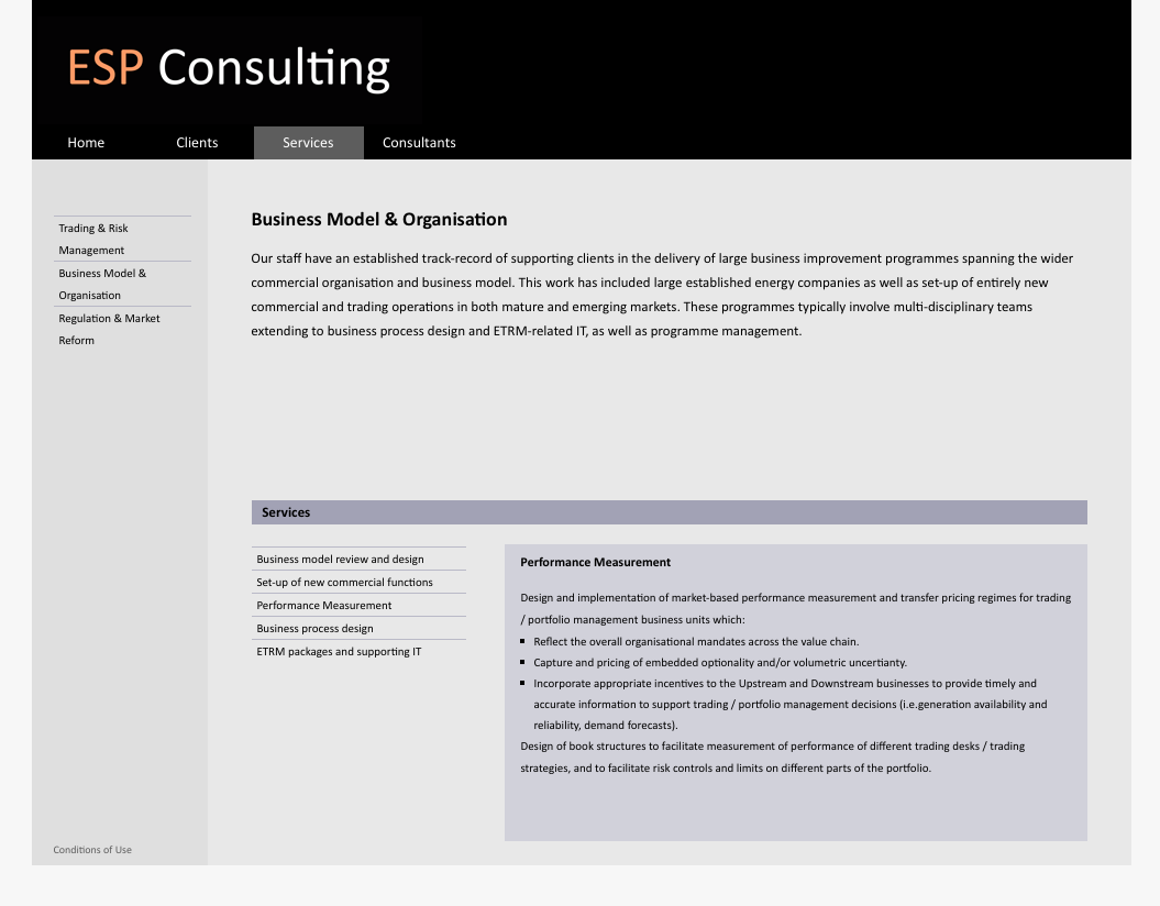
Their previous site was built in-house – with tremendous craftsmanship – but had become a little long in the tooth, used old school tables for layout, and couldn’t easily be maintained (someone tried once, to make it work better for public sector clients stuck on IE6, and it wasn’t a happy experience). Here’s what it looked like:
It’s not exactly a cartoons and flashing lights sector, so Soren and colleagues needed something sober and professional, and quite liked the muted, gimmick-free look and feel of their old site. The brief here, as with many of my clients, was to make the site easier to manage, bring it up to date but not scare the horses.
I thought there were three great opportunities here:
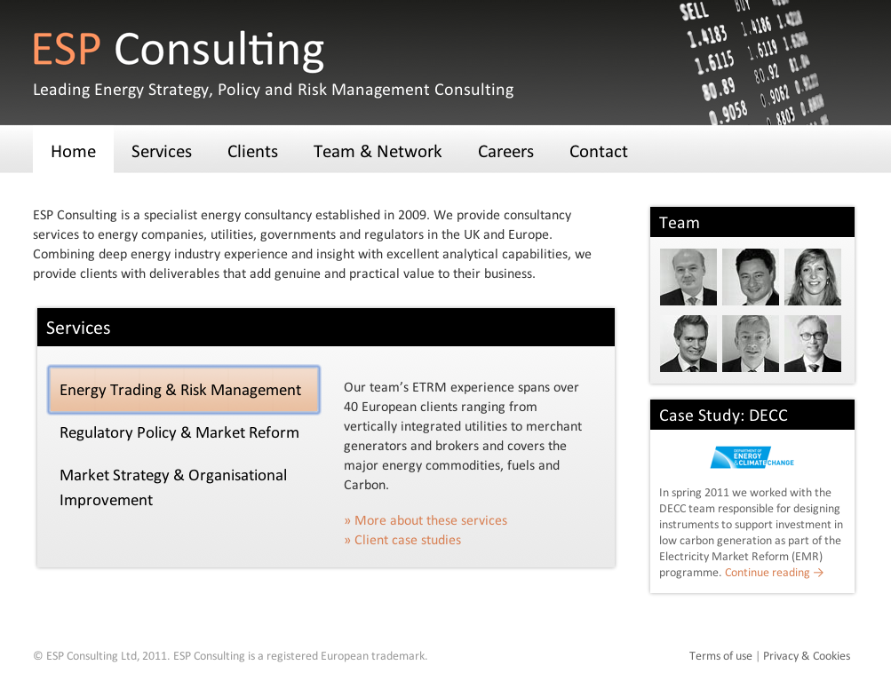
- Emphasise the experience and skills of the team, featuring them on the homepage to show the warm, professional, widely-experienced consultancy team they are
- Sort out SEO, taking on the challenge of being one amongst many ‘ESPs’ online, including several different types of consultancy, and sorting out an issue which saw only Soren’s profile page appearing on Google’s results page
- Bring out the service areas and case studies more clearly, to make it clearer what the company offers
If I make it sound like I brought all the ideas, that’s unfair. Soren and team were really the driving force here, and simply wanted help translating their vision into clean, flexible, no-nonsense reality. So here’s how it looks now:
The new site is WordPress-based, starting from the Twenty Ten theme framework, which meets the requirement for ease of updates. Even without being too clever, WordPress provided lots of useful pegs we could use to create the kind of simple CMS lots of businesses like ESP need:
- team profiles are built from extended WordPress user profiles, adding fields for qualifications, descriptions, and an embedded geocoded map showing international experience
- case studies are WordPress posts with a custom field to hold the client profile and judicious use of featured images to render logos at different sizes in different places on the site. The normal post navigation has been adapted to turn navigation between posts into a loop, rather than a chronological series
- we’re using a perennial favourite, the Widget Logic plugin to handle showing different widgets from the same widget area in different places on the site
- I wrote a few shortcodes too to help feature the list of users (consultants) on other pages
The ESP team know what they’re looking for, and sometimes, even how they’d like it laid out. We’ve discussed things amicably, come up with good ideas together, and made WordPress work in ways which are surprisingly elegant at times. It works in IE6, for public sector clients. The site’s now at least a place higher in Google for the same search term, and now ranks well for lots of other key terms too. In a niche sector not full of elegant websites, it feels to me (and I’m biased) like a more contemporary business, with credibility, professionalism and subtlety. Much, you might say, like the public sector…


