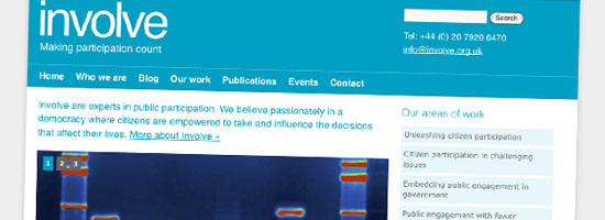
One of the nice things about my new life is that I get to work with and for people from outside government, as well as those inside. Our latest non-gov project went live late last week, replacing the website for public engagement experts Involve with something cleaner, neater and more flexible.
Simon, Involve’s director, had a number of issues with the previous site. It didn’t feature their core areas of work prominently, it hid search and newsletter signup away behind tiny buttons, it was expensive to tweak and – the biggie for any think tank-style organisation in 2011 – it constrained their ability to blog easily and prominently to engage their audience about their work.
The idea of migrating to WordPress (from the old site, which was SilverStripe-based) came from Involve, part of a growing trend of clients who’ve already been won over by the sales pitch for WordPress. For this kind of site, it’s absolutely the right tool, given the key goals we established:
- reducing the costs of hosting and maintenance
- improving usability, including a clearer explanation of what the organisation does and making it easier for prospective clients to get in touch
- raising the profile of fresh content from the blog and increasing the emphasis on Involve’s key areas of work
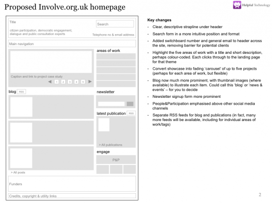
We helped clean up the site templates, retaining much of the original look and feel, which still felt contemporary and professional. As often happens, batting around some simple wireframes triggered some great discussions about content, priority and positioning. Here’s an early version:
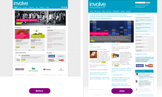
Rebuilding the site presented a great opportunity to revisit the site’s information architecture, moving the blog to a more prominent position and humanising it with author biography panels, making navigation within sections more logical, as well as adding some quick wins like the little Twitter widget of Involvers talking about their work. Here’s the before and after homepage (click to enlarge):
But the real power of WordPress for this project is through tags, enabling the Involve team to build sets of content on the site using tags as simple or complicated as they want to make them, whether it’s how they embed public engagement in government or the work they do which relates to the Big Society. It’s also handy to have flexible sidebar areas for widgets, so the team can promote major launches or events without making changes to their template.
We’ve not pushed WordPress particularly hard to achieve it, but the result is a site that feels like a proper corporate presence for an organisation which is about engagement, blending publishing and discussion, people and projects. We’ll see how things go over the coming months, but I hope the team will find WordPress snappier, easier to extend, and a real boon to their search engine positioning.


