The challenge for ‘government 2.0 sites’ (a phrase I feel slightly dirty for using) which aim to engage beyond the core stakeholder audience, is to come up with an experience which fits with the content of the policy, builds credibility with visitors and provides value to the policymaking process. You can have all the comments, Twitter streams, YouTube videos and forums you want, but if nobody’s listening or those channels feel fake, they’re at best counterproductive and at worst corrosive.
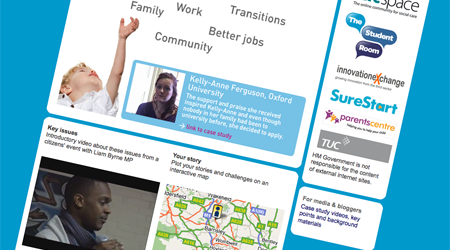
So Simon’s review of the Cabinet Office-led New Opportunities site (on which I’ve been assisting as an adviser) is pretty fair I think. Within the unusual constraints of a truly cross-Government document – with all the inevitable sensisitivites and complex accountabilities that entails – the strategy was focussed on conveying the core content in an engaging way and providing a credible and workable system for discussion.
Functionally, there were three big ideas, on top of the video-enhanced content which is a fairly standard feature of big government launches these days:
- Providing a Google map-based commenting system for people to share their own stories of inspirational people who have help helped them on their way in life, and the challenges they still face to getting on in education, work or their community, inspired by the BBC’s Credit Crunch mapping
- Semi-formal partnerships with online communities who bring together frontline staff with an interest in social mobility, blogging stakeholders, or user-generated forums such as The Student Room
- A first stab at creating a social media news release for a government launch
We’ll have to see how things go with #1 – I suspect it’s probably a concept that works better on high traffic sites or with a slightly sharper focus to it.
#2 seems genuinely exciting and the direction of travel that the Power of Information Review set us to follow: go to where the people are. Though it’s often easier and more comforting to set up a fresh blog or forum for feedback, the chances of a lively debate beyond your existing stakeholder network are slim. By contrast, it’s really not that hard to make some calls and emails to the community managers of big online communities and get them to set up some threads or tee up blog posts – it’s just a job which I imagine tends to fall between a press office and a web team most of the time despite it being a real win-win all round. Working directly with partners like the TUC and The Student Room has been an absolute pleasure, and the start of many more fruitful partnerships I hope.
#3 feels like the start of a journey. There’s lots of talk about the increasingly diverse and multimedia delivery of news, but virtually all of the content government creates for this audience is plain text. The standard for SMNR’s has been defined (as has a microformat – h/t Jason Ryan). Back at DIUS, we’re looking hard at the practical steps to take to make SMNR’s a reality, and for the New Opportunities project the team have put together a starter for ten: multiple news releases, our own tagged bookmarks, an evolving list of tagged mentions of the policy online, embeddable video, social bookmarking buttons and bullet point summaries of the key points. Next time we try this, I think it needs a clearer distribution strategy to get the content in front of the right people, but it’s a start.
But overwhelmingly the best part of the experience for me has been working with the e-Media team at Cabinet Office. These folks – particularly the quartet of David, Mizan, Rob and Hazel – were creative, unflappable and for me the most important – true masters of their digital craft. I’ve been strengthened in my belief (shared with some notable others) in the enormous value of in-house resource for digital engagement. When you have a crack team of system administrator, developer, filmmaker and editor who can take the most sketchy brief and run with it, publish over 100 pages of content overnight via surely Whitehall’s best value, open source CMS and cheerfully pull all-nighters to make sure their code degrades gracefully, you know you’re onto a good thing. Thanks too to New Media Maze (of Number 10 fame) for some great creative concepts and the patience of saints in the face of the kind of client bad behaviour I swore I’d never succumb to.
Personally, my skillset is likely to stay limited to PHP and WordPress, but it’s been a reminder that there are other good platforms out there – you can use .NET and still be creative and cheap.

Comments
The site looks really good and I like the social media news release. It seems to me that all of this is about promoting as widespread a debate as possible which is great but I still have some worries about what you do with the responses and conversations (if anything (and I don’t mean that cynically – just with the best will in the world it must be very difficult to do anything with hundreds or thousands of different comments and conversations all perhaps starting from the same point but very quickly going off in divergent directions)).
To some extent I suppose it is fine to say: if we can get lots more people talking and thinking about social mobility, that is a good thing in itself (or to be more civil service neutral – that contributes to ministerial objectives). I suppose one could also argue that an issue-promoting “consultation” prepares the way for a detailed consultation where responses have more chance of really shaping the government’s actions. But that for me is the big issue: how do we innovate in relation to government consultations so that the inputs from citizens aggregate in a way that is likely to be more usable by civil servants/ministers and therefore more clearly influential?
A wonderfully honest write-up Steph.
I’ve commented on Ross’s blog to say I don’t think the interactive bit is quite strong enough within the site itself, but the partnership approach is much the better way to go.
The concept of the social media news release is an exciting one – and followed through well, right down to the use of bookmarking/sharing links on every page. I think you’re right: this hasn’t been done before because it falls between the cracks of press and web teams. But I also wonder how many people had thought of doing it. To which end, I am sharing it round.
[…] Steph Gray – who advised on the development – has a done a write […]
Great to see another Whitehall department using open source, is this something you adviced on?.
Very impressive for the most part, including the concept. The pages could have been shorter.
Well done on this project Steph – moving everything along a step further in the right direction – and also on the frank write-up here, which was very interesting for me and which I’m already busy sharing around (And of course as was finding your very good blog for the first time!). Cheers, John
‘@Paul: that’s true, and particularly so for a cross-government paper like this one, as I hinted. A White Paper isn’t formally a consultative document, of course, or else there would certainly have been more formal channels for feedback.
There’s a trusty Netvibes page helping to keep track of online coverage via aggregated Google blog and Twitter searches, which has helped identify coverage to be tagged and shared on the bloggers page. But the challenge here as for any conversation we try to launch, is to get officials in particular to track and take on board the online conversations.
@Sam: Thanks – no, the open source CMS was in place already, thanks to the sterling work and thriftiness of the Cabinet Office team.
[…] which leads to a page of White Paper Resources for Media and Bloggers. Resources that us bloggers can use to build a post around (remembering, of course, who actually produced the resources…), or at least that will act as a starting point for developing an understanding of what the government thinks it’s trying to achieve with yet more legislation. (See also: New Opportunities – Goevrnment 2.0 sites.) […]